
UX Designer
2009 - 2013
Vast is a vertical search engine company focusing on autos, real estate & travel. Backed by ventures like Clearstone Venture Partners and Leapfrog Ventures; Vast connects buyers, sellers & publishers.
I joined Vast as the second designer in 2009. I was responsible for product, UX and visual design in autos and travel verticals. We beat our conversion goals many times, provided successful white-label solutions and shipped products for partners like AOL, Yahoo!, Bing, KBB.com & TrueCar and Southwest Airlines.
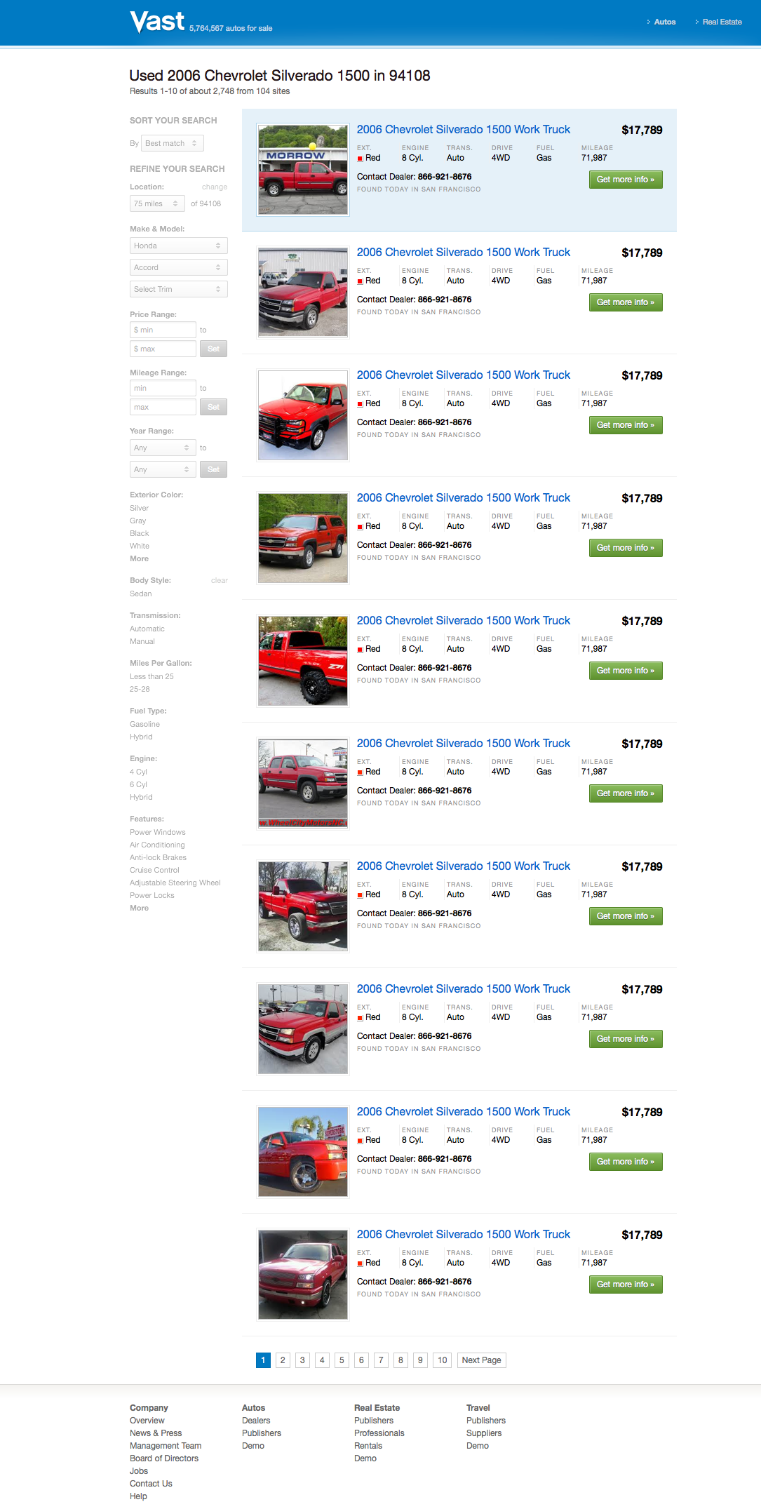
Vast automotive marketplace platform allows leading publisher & portal websites to provide painless new & used car search experience. This ever evolving platform is connecting millions of customers with dealers all over the U.S. every day. Below you’ll see the general concept of the autos platform with some successful & failed experiments.
Every partner website we worked with had different requirements. Varying page widths, font sizes, amount of display ads obligated us to design the Vast Autos Platform modularly so it would fit into any Vast’s partner websites.

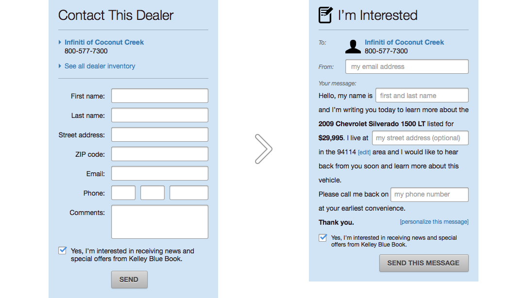
Lead form, the way for customers to contact sellers, is one of the most vital elements on the platform. We experimented with a lot of ideas from making the form eye-candy to simplifying it to just a few form fields. But it was the Mad-Libs experiment rocked our conversion rates by 25-40%. We wanted to get rid off the traditional contact-form approach and make it more human. As if the customer was writing a letter to the seller.
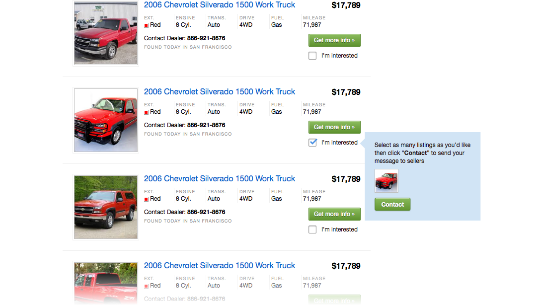
After some user research, we learned that many customers end up buying a different vehicle then the vehicle they contacted about. In other words, contacting through the Autos Platform is mostly a conversation starter. That made us curious to explore faster ways of contacting buyers with sellers. Instead of filling out the lead form on details pages each time, what if they contacted multiple sellers at once straight from the search results page? We came up with Multi-leads. It was also a huge success.
Another component we experimented on was the landing page; the page where the customers start their search. It's really easy for customers to get lost in thousands of search results. We already give them tools to filter their results down later in the search experience but we wanted to see if we can do this in the beginning. In the Landing Wizard experiment, we asked customers what kind of car they are looking for in a few steps. Number of steps would vary depending on the number of results they'd get. If a good amount of results is reached, then we'd stop asking questions and take them to the results. Landing Wizard was one of the failed tests.
Click on the right of the screen to go to the next step. Left side goes to the previous step.
Seeing the Landing Wizard test fail made us more curious to explore even more. We knew there was more to explore. Maybe multiple steps took too much time of the customers and didn't allow instant interaction with every section of the search. So we kept the categorized approach but killed the steps. A Compact Landing page allowed customers to see the most important search categories on the same page. Interacting with one search category instantly updated the other search categories and number of results. This was a huge success.
Click on the right of the screen to go to the next step. Left side goes to the previous step.